

In this training session, we will introduce you to Dashboards and guide you on how to access them.
Accessing Dashboards
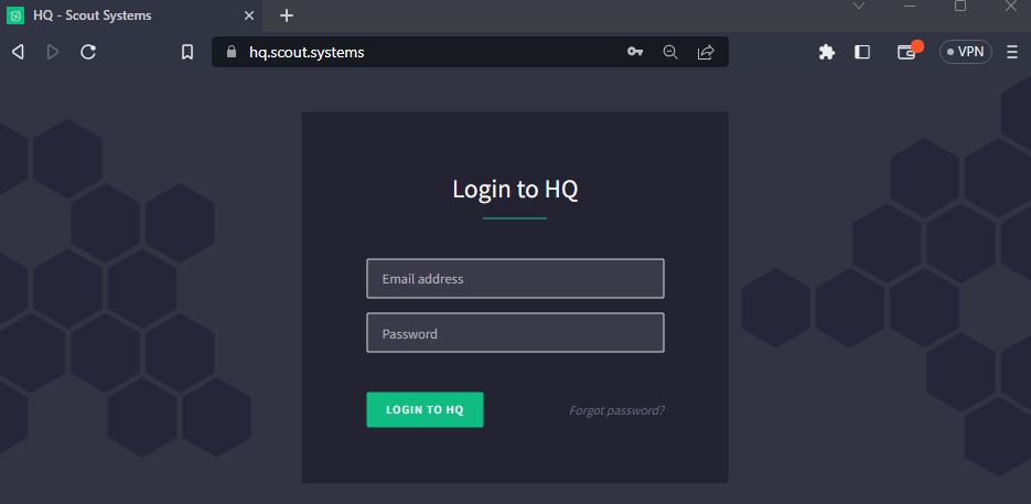
Dashboards is an application found within HQ (http://hq.scout.systems). To access it, you will need to have an HQ Account with Report access enabled. Use the email and password associated with your account to log in to HQ.
After logging in, click on the green button located at the top-left corner to access the navigation menu. The white icons indicate the applications you have access to, while the shaded icons indicate applications you don't have access to.
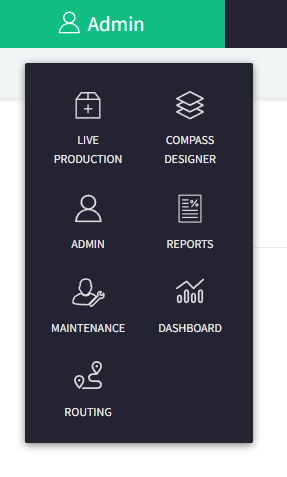
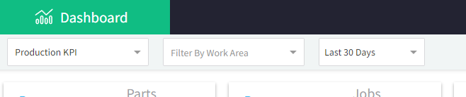
When you click on "Dashboard", it will lead you to the application where you'll get to select which Dashboard and Work Area you would like to review.
Production KPI
Updating every minute, the Production KPI Dashboard provides a comprehensive overview of a factory, featuring a range of industry-standard Key Performance Indicators (KPIs). At the top of the screen, you'll find a row of snapshot statistics, offering information on the total number of Parts and Jobs completed, along with metrics such as First Pass Yield and Overall Equipment Effectiveness. Additionally, the dashboard displays the current status of Active and Paused Stations on the right-hand side.
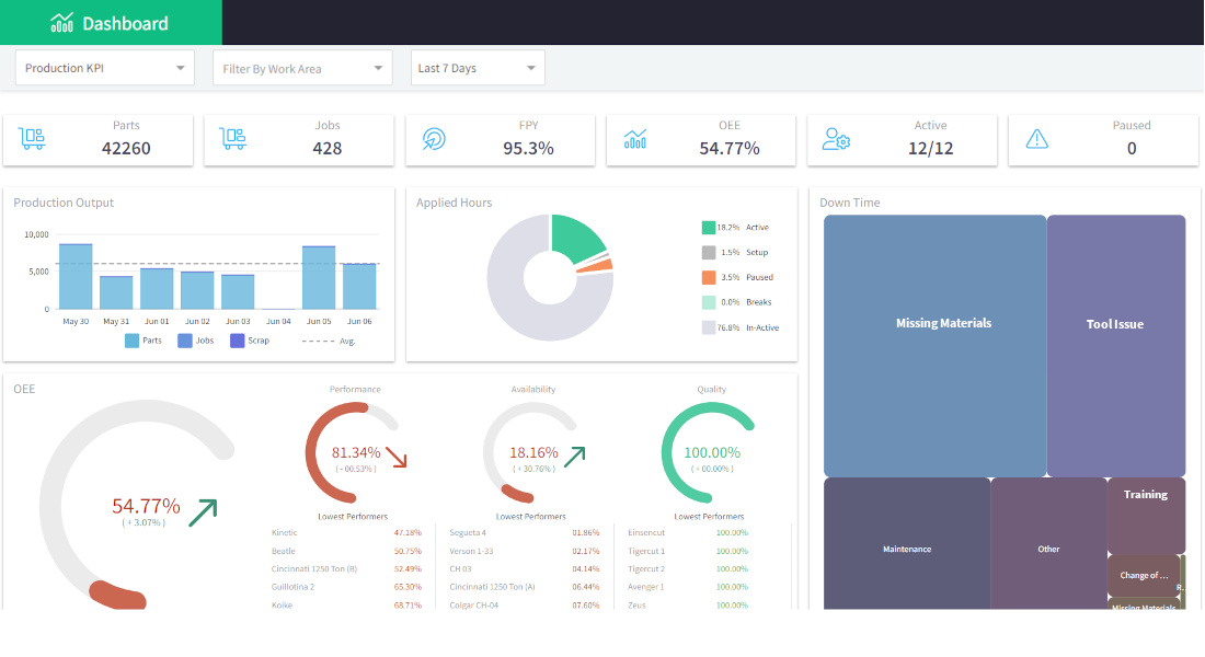
Moving to the second row, you'll encounter two distinct blocks. The first block showcases Production Output figures, including Parts, Jobs, and Scrap. Adjacent to this, you'll find the Applied Hours section, which highlights the allocation of labor across different tasks. Directly beneath these sections, the Overall Effectiveness of the Work Area is displayed, with arrows indicating whether the metrics are trending in a positive or negative direction.
On the far right of the dashboard lies the visual representation of weighted sources of Production Stops. The size of each block corresponds to the amount of time lost due to that particular reason. If these categories have further sub-reasons configured, clicking on the respective box enables users to zoom in, revealing the sub-reason weights presented in a similar visual format.
ANDON
Updating every minute, the ANDON Dashboard offers users a real-time visual representation of Production Stops. Users have the option to specify a Work Area and can choose to display all stations or solely those that are currently halted. This dynamic tool serves as a visual aid to promptly assess and address any interruptions in production.
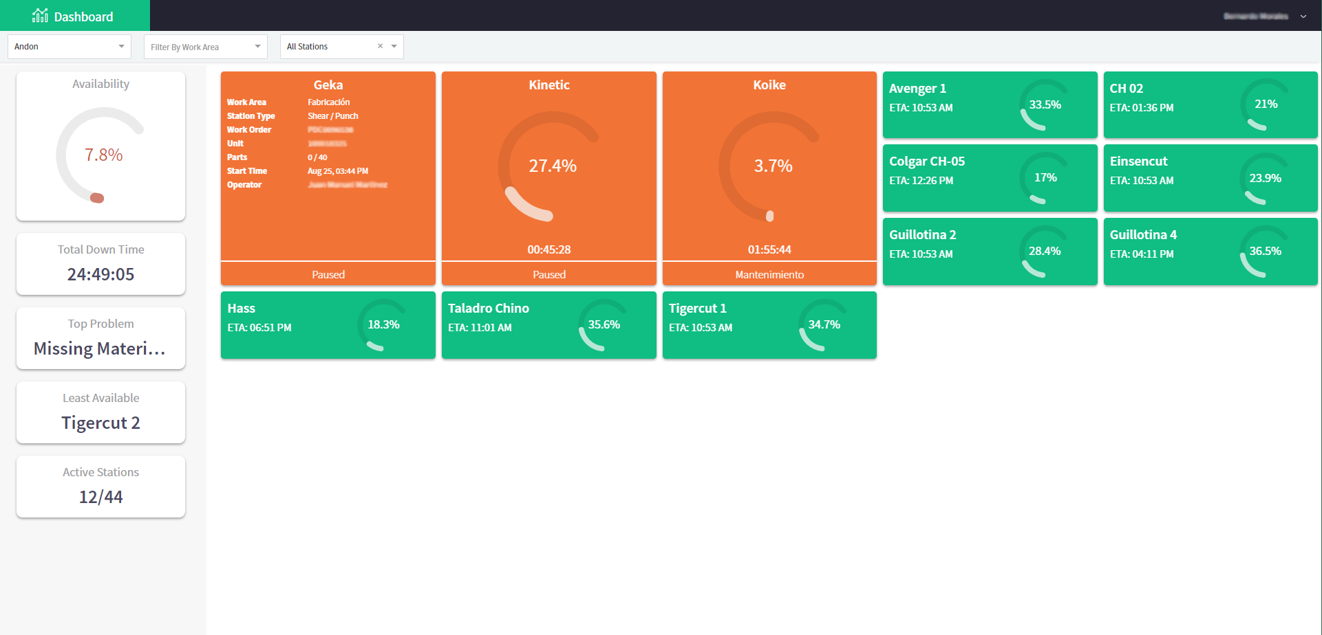
The tiles on the ANDON Dashboard are color-coded to indicate their respective statuses. Green tiles signify that value is currently being created, while gray tiles indicate that the Station is in Setup. Blue tiles represent stations with missing materials, and default paused Stations are displayed as orange. HQ Administrators have the capability to configure pause reasons for each Work Area, enabling the setting of unique color codes that will be displayed on this dashboard.
Paused tiles are designed to expand in size, making them more prominent on the ANDON Dashboard. When clicked, these tiles will flip over, revealing additional information related to the specific Work Order associated with that station. This feature provides a convenient way to access detailed insights about the paused production process, aiding in timely decision-making and troubleshooting.
The left side of the screen displays essential metrics related to the support and performance of the production floor, and these metrics are reset every 24 hours. The "Availability" metric represents the overall percentage of time during which value is being created in the Work Area. "Total Down Time" represents the cumulative duration of time lost due to various production stops.
Directly beneath these metrics, users can access information about the "Top Problem" area or issue that has caused the most significant disruptions in production, and the "Lowest Performing Station" that has experienced the lowest efficiency or effectiveness. This information is valuable for support staff as it enables them to prioritize their efforts and interventions effectively to maximize value creation and optimize production processes.

 2 min read